Karen Caldwell 11 January 2023
Meaningful communication has a purpose, beyond simply sharing information. Oddly, we rarely think about the design of our communication, our information, to meet our purpose.
But information design has enormous impact. It matters.
Follow these 5 tips to design information & achieve your purpose. Every time.
- Start with your “why” and “who” – Purpose & Audience
- Create your message – Focus on content
- Design your information – Chunk & KISS your content
- Format for readability – Who knew Beyonce could help?
- Be the guide on the side – Orient your audience
1 – Start with your “why” and “who”
Why am I communicating? State your purpose
Why are you communicating? Whether writing, speaking, creating a video or infographic, or even for yourself (e.g., journaling), start with your why. State your purpose or goal clearly to yourself, first.
This will increase the chances of your audience sticking with your message.
When hurried, people don’t read every single carefully chosen, thoroughly considered, grammatically perfect, correctly spelled, precise written word. They skim. If a message’s purpose is not immediately obvious, readers must allocate more of their limited time to read and understand it. This increases the chance they will just give up and move on to the next item competing for their attention.
Write shorter messages Rogers & Lasky-Fink (2020)
Renee Hobbs’ Create to Learn outlines the 3 most common purposes: entertain, inform, and persuade, and yes, you’ll often have a mix of purposes & goals. When you are about to speak, type, text, or write pause and think: what’s my goal? What do I want to happen as a result of my message?
Once you start communicating, this is what you actually begin with: your bottom line, or main message.
I start off by stating my purpose internally (especially in conversation) and when I’m drafting an email or other message (e.g., video script), I write my purpose (bottom line) at the top of the page.
Plain English, no jargon, straightforward.
This “no B.S.” approach strips away that pesky voice in my head that tells me to try to sound more academic or formal. When I am direct & use plain language it grounds me and gives me much needed focus to return to as and when I need it (which is often… I can really go off track when I’m creating my message).
Who am I communicating with? Identify your audience
You may have a general audience in mind, especially if you’re blogging, but if you think carefully, your audience is actually a more narrow field. Spend some time to consider who you want to connect with. Be specific.
It’ll help to think carefully about who is “encoding” your message. Encoding is a helpful way of thinking about communication, because it forces us to think about the impact of our message on others.
Who is your target audience? What do you want your audience to think, feel, or do as a result of your actions? Although you might think you can create messages for a wide target audience – “everybody” – in reality, messages are most effective when they are designed for a particular, targeted group.
Create to Learn Renee Hobbs (2017, p. 32)
Once you’ve defined your audience, connect your purpose: what do you want your audience to know, feel, or do? Put differently, why should they pay attention to (read, listen to, watch) your message? What’s in it for them?
Either way, the more you specify your audience, the more effective your message, and easier it is to design its information.
2 – Create your message
When you have a clear idea of your why as well as a picture in your mind of who’s reading, listening to, or watching your message, you straighten your spine and start off with a sense of clarity. Your focus now is drafting a message which, of course, achieves your goal or purpose and “speaks” directly to your audience.
Content rules. Boil it down and say what you mean.
Another tip is to turn off the same pesky voice that urges you to sound more formal – your internal editing chip, that nit-picky, judgy, annoying voice that tells you to use a thesaurus or longer, more complex sentence structure.
Shut it down. It adds no value. Your focus now is creating content. Content that aligns with your purpose and speaks directly to your audience.
You may want to brainstorm points first in a bulleted list or better yet, sketch ideas by mixing words with images. Paint a picture with words (and ideally, imagery) that captures your message.
Purpose first, specific audience second, then create your message in blunt, direct language.
3 – Design your information
Strategic design of your ideas means that you have a much better chance of achieving your purpose and connecting with your audience. It’s time to examine your information from your audience’s perspective by chunking & kissing (keep it short & simple).
Chunk it, Label it
Our brains seek meaning before details. They constantly are in pattern-seeking mode. And we’re now able to measure this. In This is your brain detecting patterns, ScienceDaily describes findings from a recent study where brain activity was measured using an MRI machine. Researchers Krajbich & Konovalov explain that the results from their 2018 study show that it isn’t just about predicting what’s coming next, the brain is actively looking for rules to help predict better and faster. Rules are a type of pattern.
What does that mean for information design? Identify patterns. Be intentional about setting your audience up for success with clear, identifiable chunks of information. These are patterns we all seek.
Once you have your main ideas out of your head and on paper or screen, step back and identify “chunks”. In other words, organize your ideas. These labels will become headings. A helpful starting point is to identify similarities, differences, processes, lists, and other organizing patterns. And label them. They may seem self-evident but they’re not. Don’t leave it up to your audience. Labels are “signposts” for patterns. They serve your audience’s pattern-seeking brain.
An example will help here. The Center for Disease Control (CDC) prioritizes information design, thankfully. They communicate to healthcare professionals and a wide range of folks. Their purpose is to inform their audience effectively & efficiently, and they valuable guidance to do so.
Break text into chunks to help the audience remember and group similar information. Chunked information also looks less dense and overwhelming to read.
A “chunk” is the amount of words or numbers that people can hold in their short-term memory and group with other words or numbers. A chunk should be only one idea that people can connect to other, related ideas.
Use headings to organize and label chunks. Headings are sometimes referred to as “advance organizers.” Consider information flow in the material when creating headings and chunks. Headings must accurately reflect the information that follows, or they can distract or confuse the audience.
Is the information organized with chunks and headings? CDC (2022 July 20)
Trim the Language, Keep it Short & Simple (KISS)
Now that you’ve chunked your message, it helps to walk away from it if possible. This helps enormously with your next step: using the DELETE button (or your red pen) and simplifying your language.
Shorten your message.
Cut, cut, then cut some more. Your audience has limited time, and they generally won’t read a page filled with lengthy sentences and paragraphs. Cut down your content.
Simplify with plain language and shorter sentences.
You’re not “dumbing down” your content. You’re making it clearer. This is where you truly put yourself in your audience’s shoes.
Though it seems like a no-brainer to use language that is matched to your audience, this is a tough one, especially if we’re communicating about content from a variety of sources. The content – our sources – likely contain jargon and more complex, longer sentences.
Some writers use an academic tone out of habit or try to impress readers with complex sentences and showy vocabulary. The misconceived notion that long sentences and big words make you sound smarter (or more professional) results in great sacrifices to readability and credibility.
All writers, including producers of technical and academic content, owe it to readers to communicate information simply, and clearly. Remember that the primary goal of communication is to convey information.
Plain language is for everyone, even experts Hoa Loranger, Nielson Norman Group (2017)
These typically are not helpful for our audience, even if it’s academic.
4 – Format for readability
Drafting, chunking (& labeling), shortening, and simplifying your content is a powerful process of meaning making.
Your final step is to now format your message. Here are the top formatting strategies to set your audience up for success. Success means that, not only will they “consume” your message (read, listen to, or view) but also take action – remember you likely want them to do something.
Formatting makes all the difference.
Headings
You’ve labeled your chunks and these now become headings. Design your headings with specificity, “skimmability” & accessibility, in mind.
- Make your message skimmable by using specific headings. Bland & meaningless language like “introduction” or “my thoughts” don’t help your busy audience.
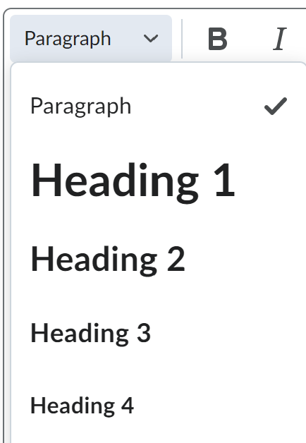
- Accessibility widens your audience and aligns with your core value of inclusion. It’s super easy nowadays to format your content for screen readers, for example. Use the editing tools available in all online/digital environments such as in a word-processing app like Word (text & video, under Styles tab) and even in a learning management systems such as Brightspace (text, video), as the image below illustrates.
- Images such as word diagrams, graphs, and diagrams are powerful tools for communication. As a habit, describe the imagery in words first – tell your audience what they represent and what to look for. And tell screen readers what the image is by using the alt-text function in any editing system. It’s pretty straightforward in Word (text & video) and LMSs like Brightspace.
Alignment (aka justification) Matters
I don’t often cite Beyonce but I proudly do so here: to the left, to the left. Whether you’re writing an email, blog, slide, or infographic keep your text aligned to the left. This is also referred to as justifying your text and it matters.
Left aligned text is easier to read than centered text for paragraphs. This is because when you center your text, the starting place of each line changes. This forces your users to work harder to find where each line begins to continue reading. Without a straight left edge, there is no consistent place where users can move their eyes to when they complete each line.
Why you should never center align paragraph text UX Movement (2011)
When we read in English our eyes move from left to right. Our brains default to this instinct or pattern, so when text is centred or aligned (justified) to the right, it decreases readability. Simply put, your audience has trouble reading your message.
It’s a pretty straightforward fix.
Look for the alignment options symbol below (from Word) in any editing toolbar. Speaking of Word, use CTRL-L (Windows) or CMD-L (Mac).
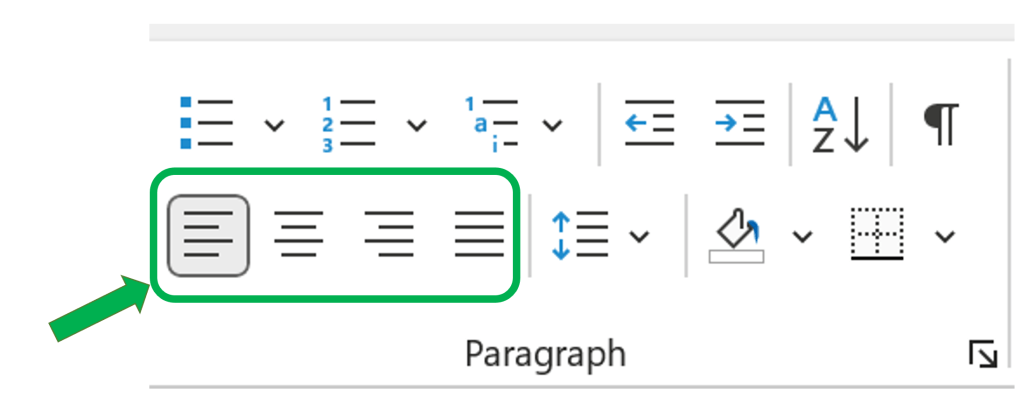
Of course, centred titles and very brief lines of text are fine. Anything longer? Channel Beyonce and align it to the left to the left.
Mix it up: Short Paragraphs & Bullet Points
Finally, you’re already shortening your content and have it chunked into smaller units with headings. Now put it all together with short paragraphs with one central idea or point and bullet points or numbered lists.
A few tiny dots attract the eye and can make a complex concept understandable. Readers perceive the bullets as shortcuts to succinct, high-priority content. It’s not surprising that, in usability studies, we observe readers gravitate towards bulleted lists with fervor. Web readers want to digest content quickly.
7 Tips for Presenting Bulleted Lists in Digital Content Hoa Loranger (2017)
How about an example? Compare the versions below and notice how the second one has greater “readability”.
Version 1
Our Spa getaway package includes two-night accommodation, two 50-minute spa treatments of your choice, an in-room breakfast for two, and gift basket upon arrival.
Version 2
Our Spa getaway package includes:
7 Tips for Presenting Bulleted Lists in Digital Content Hoa Loranger (2017)
- Two-night accommodation
- Two 50-minute spa treatment of your choice
- An in-room breakfast for two
- Gift basket upon arrival
5 – Be the guide on the side
Guiding your audience is all about achieving your purpose. Remember the part about the brain being a pattern-seeking organ? This is where you take your communication up one final notch by orienting your audience. Everywhere.
I go into more depth on the why in Get to the point!
Here’s the how.
- Create a placeholder for your opening message. Then move on, starting at step 1, above. In other words, don’t even try to write your introductory message. Leave it til the very end. It gets MUCH easier once you’ve fleshed out your ideas and followed the steps above to design your information.
- Once you’re happy with your content and its design, step back and adjust your focus to guiding or orienting your audience. Somewhere in your opening message, tell them what they’ll find. Yes, this is the opposite of how we learned to write in school, where we save our dramatic conclusion til the end.
- In an email, audio, or video message be especially direct and succinct with your orienting message. For example, I’m writing to request … or In this video, I’ll show you….
- In a report, discussion forum post or pretty much any other communication, tell your audience what you’re delivering – your content. Often, a brief sentence with a numbered list or bullet points will do the trick.
Now I’m curious about my own info design. Analyze this article with the steps and tips in mind and let me know how I did!
